Do you know about the Baskin-Robbins logo's clever "hidden" meaning?

The Hidden Detail on the Baskin-Robbins Logo You’ve Never Noticed

I scream, you scream, we all scream for 31 flavors of ice cream! The popular ice cream chain Baskin-Robbins is known for its long list of delicious flavors and pretty pink spoons. But have you ever taken a close look at the other brand imagery and wondered about the Baskin-Robbins logo meaning? There’s extra information hidden inside—and it’s not the only company logo with a secret message. Keep reading to decode the interesting information in the Baskin-Robbins logo.
Get Reader’s Digest’s Read Up newsletter for more humor, cleaning, travel, tech and fun facts all week long.
The history of the Baskin-Robbins logo

Ice cream runs in this family. A year after Irv Robbins opened his ice cream shop in Glendale, California, in 1945, his brother-in-law, Burt Baskin, opened another one in nearby Pasadena. It didn’t take very long for the two to merge their businesses.
Baskin and Robbins created Baskin-Robbins in 1953. Their shop offered 31 flavors so that visitors could theoretically come back each day of the month for something new. At the time, it was rare to offer as many flavors as they did, and they wanted to tout it in their logo and on their storefronts. The number 31 proudly stood out from the name, with “31” written alongside “Baskin-Robbins Ice Cream.”
In 1991, Baskin-Robbins changed its signature logo to have the names “Baskin” and “Robbins” sandwich the number 31. This is also when they introduced the pink-and-blue color scheme.
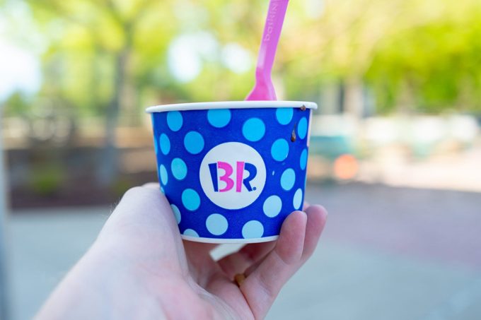
The logo was modernized in 2006, but it still included the number 31; it was just a little more camouflaged. Now that you know that, can you see it in the image above? The pink parts of the B and R make up the number 31.
Where is the “31” in the Baskin-Robbins logo now?
In 2022, the Baskin-Robbins logo got its most current makeover, the first major one since 2006. The new logo is a less playful version of the prior one. The designers swapped out blue for brown, and the font is a bit more modern. But the logo still reflects the important number 31. Like the previous logo, the 31 makes up the pink part of the letters B and R.
Although 31 flavors isn’t as breathtaking as it was all those years ago—and Baskin-Robbins has actually created more than 1,000 flavors as of today—the 31 still remains an integral part of the company’s roots and something it celebrates.
It’s OK that you were too consumed with your ice cream to notice this fun quirk. We were too!
Additional reporting by Emma Taubenfeld.
Why trust us
At Reader’s Digest, we’re committed to producing high-quality content by writers with expertise and experience in their field in consultation with relevant, qualified experts. We rely on reputable primary sources, including government and professional organizations and academic institutions as well as our writers’ personal experiences where appropriate. We verify all facts and data, back them with credible sourcing and revisit them over time to ensure they remain accurate and up to date. Read more about our team, our contributors and our editorial policies.
Sources:
- Baskin-Robbins: “About Us”
- Baskin-Robbins: “Brand Milestones”
- Baskin-Robbins: “Fun Facts”
- CNN: “This 77-year-old ice cream chain is getting a makeover”


